Enhancing the Public Transport Experience with WatchOS
Enhancing the Public Transport Experience with WatchOS
Enhancing the Public Transport Experience with WatchOS
WatchOS Adaptation
Prototype
WatchOS Adaptation
Prototype

Duration
Duration
4 months
4 months
4 months
Tools
Tools
Figma, FigJam, Notion, Whiteboard
Figma, FigJam, Notion, Whiteboard
Figma, FigJam, Notion, Whiteboard
My Role
My Role
User Researcher, UX & UI Designer
User Researcher, UX & UI Designer
User Researcher, UX & UI Designer
The Problem
The Problem
The Problem
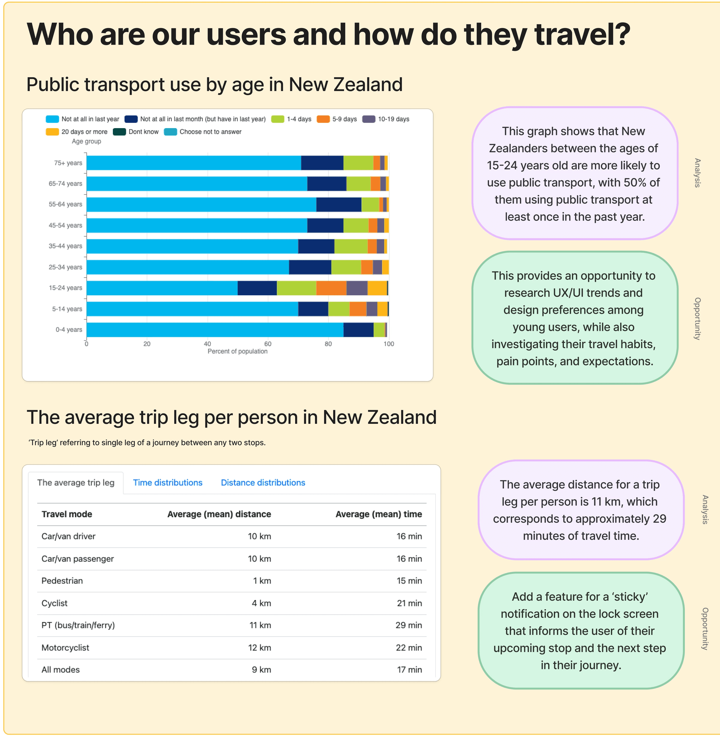
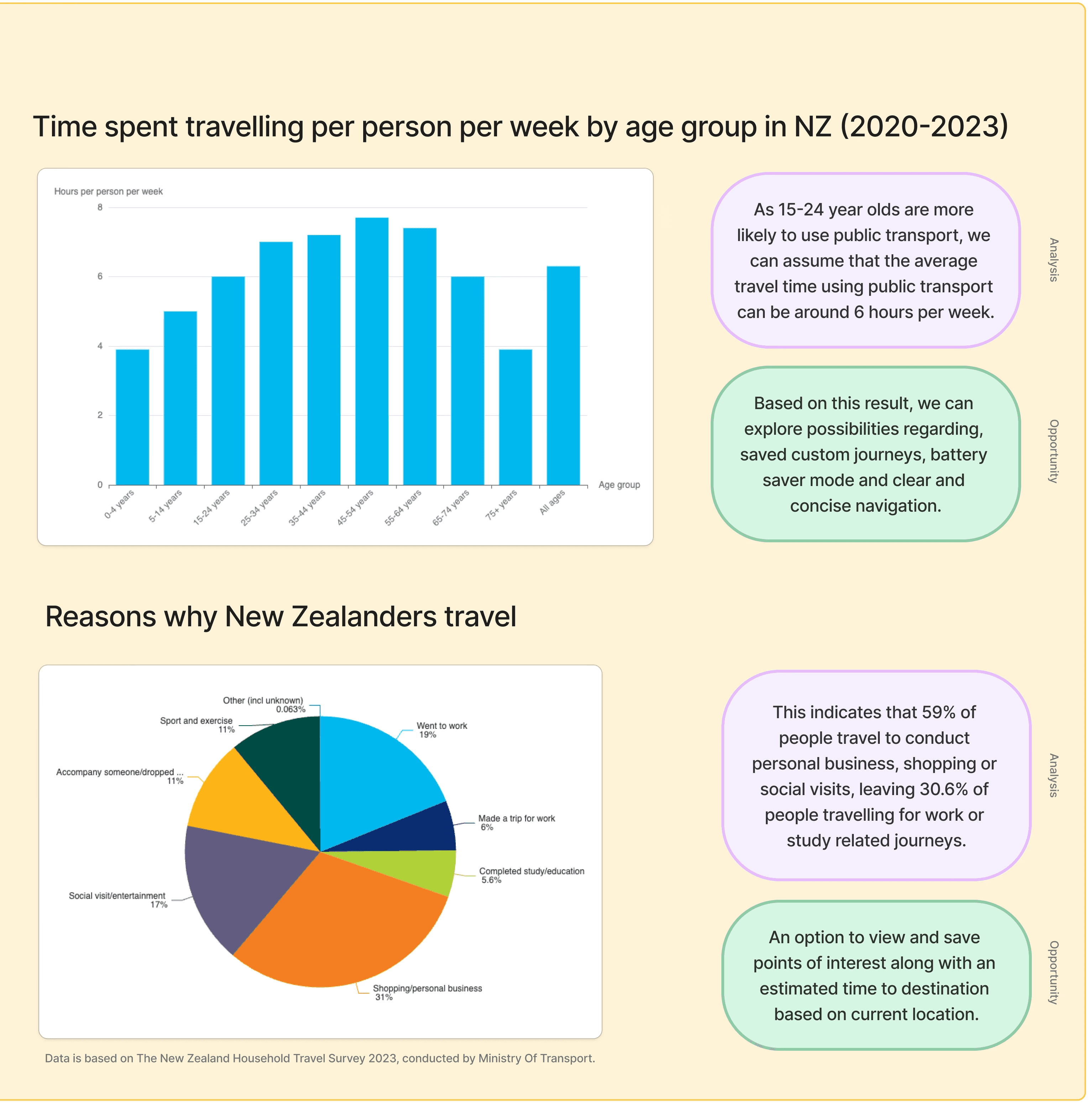
Busy Auckland Transport users who rely on smartwatches cannot easily access journey planning on their Apple Watches, because the current app is only available on mobile and desktop. This limits their ability to quickly check transit information on the go.
Busy Auckland Transport users who rely on smartwatches cannot easily access journey planning on their Apple Watches, because the current app is only available on mobile and desktop. This limits their ability to quickly check transit information on the go.
Busy Auckland Transport users who rely on smartwatches cannot easily access journey planning on their Apple Watches, because the current app is only available on mobile and desktop. This limits their ability to quickly check transit information on the go.
Why would this help users?
Why would this help users?
Why would this help users?
Real-time updates on a smartwatch help users feel safer and reduce stress by letting them check arrivals and plan journeys at a glance. Features like trip alerts and favourite routes make travel more reliable, while quick access on the wrist encourages ridership and eases pressure on drivers.
Real-time updates on a smartwatch help users feel safer and reduce stress by letting them check arrivals and plan journeys at a glance. Features like trip alerts and favourite routes make travel more reliable, while quick access on the wrist encourages ridership and eases pressure on drivers.
Real-time updates on a smartwatch help users feel safer and reduce stress by letting them check arrivals and plan journeys at a glance. Features like trip alerts and favourite routes make travel more reliable, while quick access on the wrist encourages ridership and eases pressure on drivers.
Goals
Goals
Goals
Help users access transit information quickly and easily
Help users access transit information quickly and easily
Help users access transit information quickly and easily
Support confident travel planning
Support confident travel planning
Support confident travel planning
Make public transport more convenient and reliable
Make public transport more convenient and reliable
Make public transport more convenient and reliable
A Look at the Solution
A Look at the Solution
A Look at the Solution
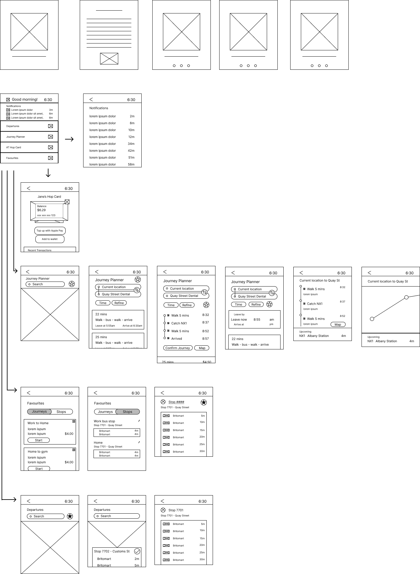
The prototype introduces an Apple Watch extension of the AT Mobile app, designed to give users quick, glanceable access to public transport information. It allows users to check real-time arrivals, receive trip alerts, and view favourite routes directly on their smartwatch. The goal is to make travel easier, reduce stress, and support confident, hands-free planning for busy commuters.
Take a look at the prototype showcasing the main user flow for journey planning, including the onboarding steps.
Research
Research
Research
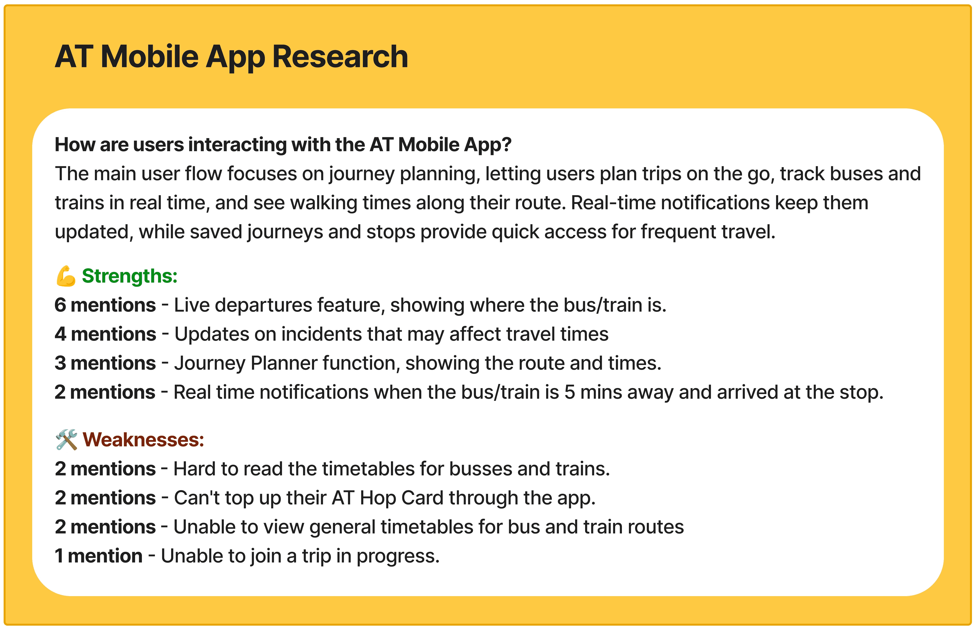
Smartwatch Research
Smartwatch Research
Smartwatch Research
Competitive Audit
Competitive Audit
Competitive Audit
I conducted a competitive audit comparing AT Mobile App with their direct and indirect competitors.
I conducted a competitive audit comparing AT Mobile App with their direct and indirect competitors.
I conducted a competitive audit comparing AT Mobile App with their direct and indirect competitors.


Personas
Personas
Personas

Storyboards
Storyboards
Storyboards


User Journey Maps
User Journey Maps
User Journey Maps
With the storyboards as a reference, I created user journey maps to identify potential pain points and highlight positive moments users might experience.
With the storyboards as a reference, I created user journey maps to identify potential pain points and highlight positive moments users might experience.
With the storyboards as a reference, I created user journey maps to identify potential pain points and highlight positive moments users might experience.


Ideation
Ideation
Ideation
With research completed, I was able to start brainstorming ideas on how to tackle this project. Starting with a sitemap, Laddering Brainstorm and HMW Questions.
With research completed, I was able to start brainstorming ideas on how to tackle this project. Starting with a sitemap, Laddering Brainstorm and HMW Questions.
With research completed, I was able to start brainstorming ideas on how to tackle this project. Starting with a sitemap, Laddering Brainstorm and HMW Questions.
Wireframes and Lo-Fi Prototypes
Wireframes and Lo-Fi Prototypes
Wireframes and Lo-Fi Prototypes
Wireframes
Lo-Fi Prototypes
Wireframes
Lo-Fi
Usability Testing with Lo-Fi Prototypes
Usability Testing with Lo-Fi Prototypes
Usability Testing with Lo-Fi Prototypes
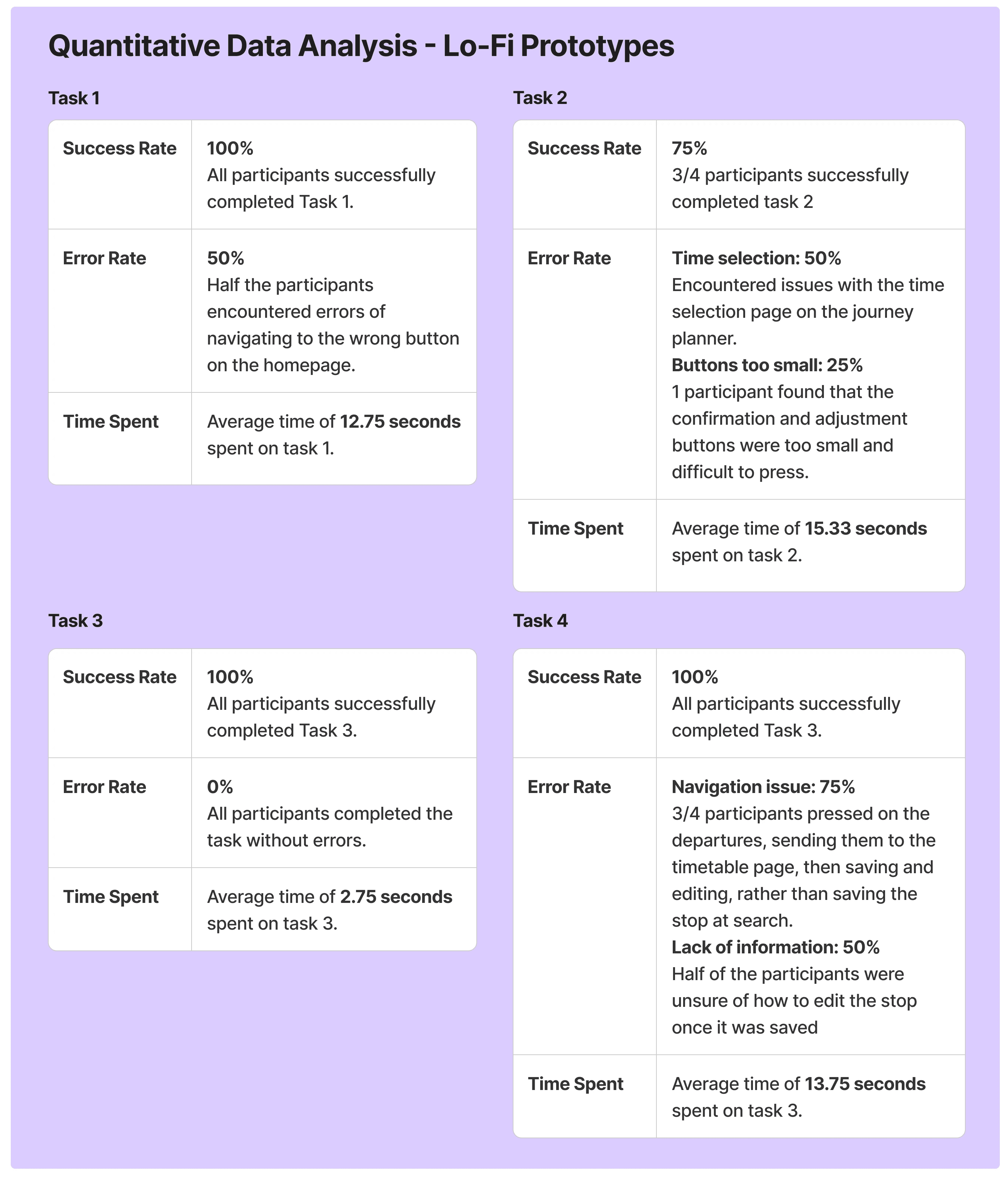
🧑💻 Method: Remote unmoderated usability study.
🧍♀️ Participants: 4 tech-savvy participants between the ages of 19-25 who are familiar with the AT Mobile app.
Task One: Check the timetable for the bus stop named 'Work Bus Stop' and check the live location of the upcoming bus.
Task Two: You plan to leave your current location in ten minutes and travel to Quay Street Dental, Please use this app to create this journey.
Task Three: Check your AT Hop Card and tell me the balance on your active card.
Task Four: Please search for stop 7702 and save it as 'Gym'
✍🏻 Post Study Questions:
"Were any tasks particularly challenging for you? and why?"
"Was it easy to navigate throughout the app?"
"How likely would you be to use a public transport app on your Apple Watch again?"
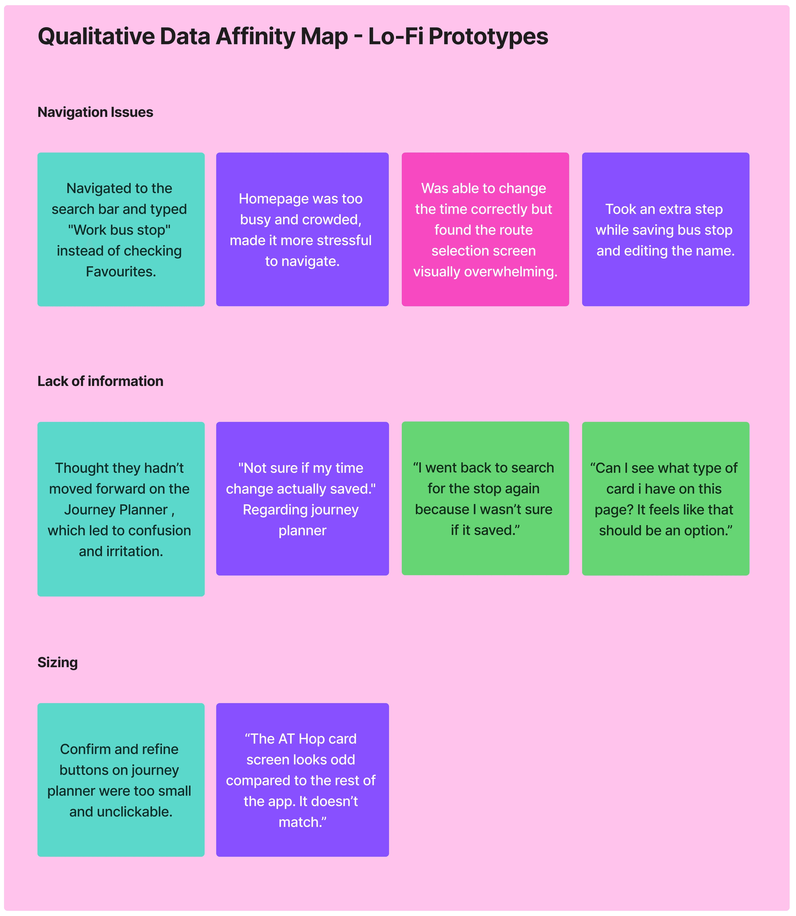
Conclusion:
👏 Positive Feedback:
No issues navigating to the AT Hop Card page
AT Hop Card was clear and easy to understand
🛠️ To iterate:
Overcrowded homepage - Hard to navigate
Unclear confirmation of saved information
Confusion when adjusting journey times
Conclusion:
👏 Positive Feedback:
No issues navigating to the AT Hop Card page
AT Hop Card was clear and easy to understand
🛠️ To iterate:
Overcrowded homepage - Hard to navigate
Unclear confirmation of saved information
Confusion when adjusting journey times
Conclusion:
👏 Positive Feedback:
No issues navigating to the AT Hop Card page
AT Hop Card was clear and easy to understand
🛠️ To iterate:
Overcrowded homepage - Hard to navigate
Unclear confirmation of saved information
Confusion when adjusting journey times
Iteration based on Usability Testing
Iteration based on Usability Testing
Iteration based on Usability Testing
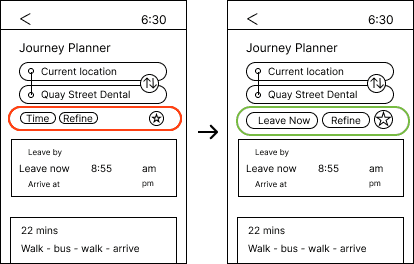
🛠️ Issue: Confusion when adjusting journey times
✅ Solution: Making the buttons bigger and changing 'Time' To 'Leave Now' eliminates a redundant step in the user flow, allows users who are in a rush to go ahead with the Journey Planner.
🛠️ Issue: Confusion when adjusting journey times
✅ Solution: Making the buttons bigger and changing 'Time' To 'Leave Now' eliminates a redundant step in the user flow, allows users who are in a rush to go ahead with the Journey Planner.
🛠️ Issue: Confusion when adjusting journey times
✅ Solution: Making the buttons bigger and changing 'Time' To 'Leave Now' eliminates a redundant step in the user flow, allows users who are in a rush to go ahead with the Journey Planner.
🛠️ Issue: Unclear confirmation of saved information
✅ Solution: Changing a tick icon to a star icon to indicate saved stops/journeys. Allowing the star to become filled when saved.
🛠️ Issue: Unclear confirmation of saved information
✅ Solution: Changing a tick icon to a star icon to indicate saved stops/journeys. Allowing the star to become filled when saved.
🛠️ Issue: Unclear confirmation of saved information
✅ Solution: Changing a tick icon to a star icon to indicate saved stops/journeys. Allowing the star to become filled when saved.
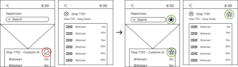
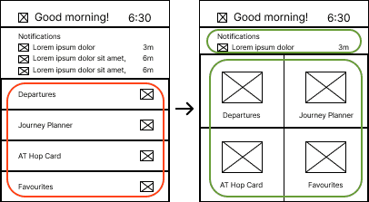
🛠️ Issue: Overcrowded homepage - Hard to navigate
✅ Solution: Pages are now in a grid UI, making it easier to view and tap for the user. Notifications bar has been shortened to allow space for users to complete the user journey.
🛠️ Issue: Overcrowded homepage - Hard to navigate
✅ Solution: Pages are now in a grid UI, making it easier to view and tap for the user. Notifications bar has been shortened to allow space for users to complete the user journey.
🛠️ Issue: Overcrowded homepage - Hard to navigate
✅ Solution: Pages are now in a grid UI, making it easier to view and tap for the user. Notifications bar has been shortened to allow space for users to complete the user journey.
Hi-Fi Prototypes
Hi-Fi Prototypes
Hi-Fi Prototypes
I set out to make the Hi-Fi Prototypes. As Auckland Transport has an existing design system and brand identity, I made sure to keep that consistent onto the Watch App.
I set out to make the Hi-Fi Prototypes. As Auckland Transport has an existing design system and brand identity, I made sure to keep that consistent onto the Watch App.
I set out to make the Hi-Fi Prototypes. As Auckland Transport has an existing design system and brand identity, I made sure to keep that consistent onto the Watch App.


Usability Testing with Hi-Fi Prototypes
Usability Testing with Hi-Fi Prototypes
Usability Testing with Hi-Fi Prototypes
🧑💻 Method: Remote unmoderated usability study.
🧍♀️ Participants: Same participants as the Lo-Fi Usability Study.
Task One: Can you please check the timetable for the bus stop named ‘Work bus stop’? What do you think about how this information is presented?
Task Two: You plan to leave your current location in ten minutes and travel to Quay Street Dental. Please use the app to create this journey. What was the experience with the visual design during this process. This can include colours, buttons, text sizing etc.
Task Three: Please check your AT Hop Card and tell me the balance on your active card. Did the design of this section make it easy to confirm that you were in the right area and find what you needed? If not, what could be improved?
Task Four: Please search for stop 7702 and save it as ‘Gym.’ How did this process feel for you and were you confident that you had completed the task?

Conclusion:
Are the following user needs achieved?
A quick and simple way to access public transport information.
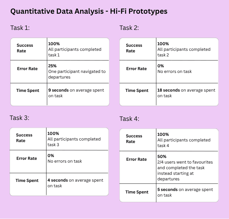
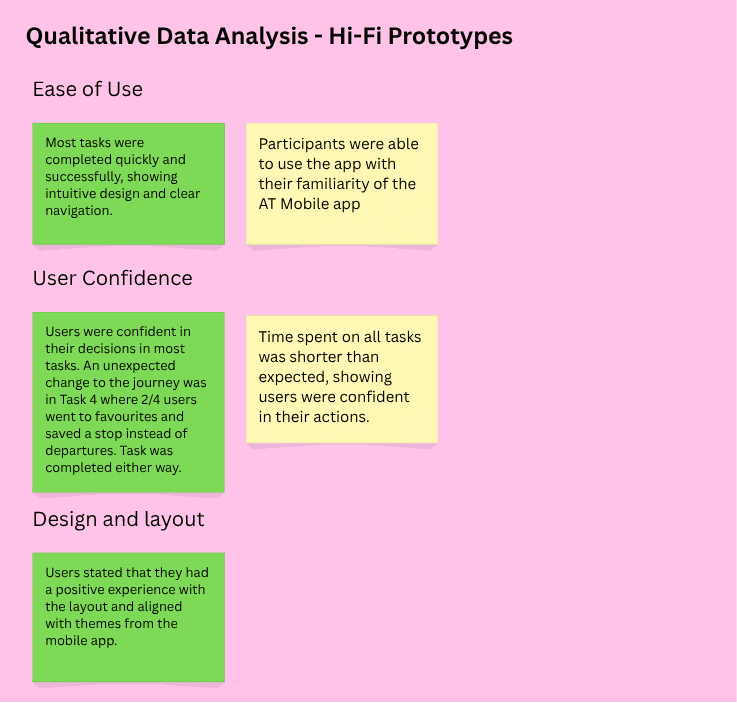
Yes! Most tasks were completed quickly and successfully, most tasks had no errors or misclicks. Time spent on all tasks were shorter than expected.
Users feel confident in their travel planning with the Watch App.
Yes! Users were confident in their decisions and stated that they had a positive experience with the UI due to familiarity of the mobile app.
Conclusion:
Are the following user needs achieved?
A quick and simple way to access public transport information.
Yes! Most tasks were completed quickly and successfully, most tasks had no errors or misclicks. Time spent on all tasks were shorter than expected.
Users feel confident in their travel planning with the Watch App.
Yes! Users were confident in their decisions and stated that they had a positive experience with the UI due to familiarity of the mobile app.
Final Thoughts and Prototypes
Final Thoughts and Prototypes
Final Thoughts and Prototypes
Designing for a smartwatch was a really interesting challenge because it forced me to think differently and focus only on what the user truly needs to see on the screen. Following an existing design system was actually freeing, as it kept me from getting carried away with too many ideas. While building the Hi-Fi prototype, I constantly compared the screens to the mobile app to make sure everything felt familiar and intuitive for users. If this were to be implemented, I’d love to explore adding safety features, offline functionality and better error handling, so users could feel confident using the app no matter the situation.
Designing for a smartwatch was a really interesting challenge because it forced me to think differently and focus only on what the user truly needs to see on the screen. Following an existing design system was actually freeing, as it kept me from getting carried away with too many ideas. While building the Hi-Fi prototype, I constantly compared the screens to the mobile app to make sure everything felt familiar and intuitive for users. If this were to be implemented, I’d love to explore adding safety features, offline functionality and better error handling, so users could feel confident using the app no matter the situation.
Designing for a smartwatch was a really interesting challenge because it forced me to think differently and focus only on what the user truly needs to see on the screen. Following an existing design system was actually freeing, as it kept me from getting carried away with too many ideas. While building the Hi-Fi prototype, I constantly compared the screens to the mobile app to make sure everything felt familiar and intuitive for users. If this were to be implemented, I’d love to explore adding safety features, offline functionality and better error handling, so users could feel confident using the app no matter the situation.
Take a look at the prototypes below!
Take a look at the prototypes below!
Take a look at the prototypes below!
Below, you can see the final prototypes in action performing key user tasks.
Below, you can see the final prototypes in action performing key user tasks.
Below, you can see the final prototypes in action performing key user tasks.
Journey Planner
Journey Planner
Departures
Departures
AT Hop Card
AT Hop Card
Favourites
Favourites
Explore More Case Studies!
Support Feature
Prototype
Optimising the Contact Page for
User Communication
Responsive Website
Live Site
Creating a Fresh and Intuitive User Experience

Support Feature
Prototype
Optimising the Contact Page for
User CommunicationResponsive Website
Live Site
Creating a Fresh and Intuitive User Experience

Explore More Case Studies!
Explore More Case Studies!
Support Feature
Prototype
Responsive Website
Live Site
Creating a Fresh and Intuitive User Experience
Support Feature
Prototype
Optimising the Contact Page for
User CommunicationResponsive Website
Live Site
Creating a Fresh and Intuitive User Experience
